Visualizations of the dataset using Looker Studio, Spreadsheet and Python
For the visualization, I used Looker Studio (formerly known as Google Data Studio).
Before creating the visualizations, I cleaned the data (sourced from a spreadsheet) using Python. After obtaining the clean data, I imported it back into the spreadsheet to make it easier to read in Looker Studio (a Google product).
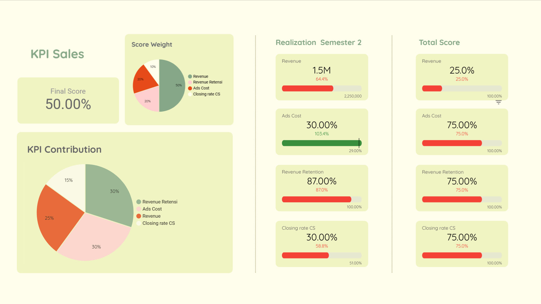
This is a snippet of a sample data visualization from a company whose data I processed and made the visualization for.
It shows that the revenue generated by the sales team this semester fell significantly short of the target, reaching less than 1%. This calls for a review of the KPI for the sales team’s revenue segment, considering both internal and external factors, as well as collaborating with the marketing team to create promotions that can better attract customers to our products.
Additionally, the ads cost worsened the situation, with spending exceeding the target for the semester. This suggests that our target audience is not sufficiently interested in the products we advertised. Therefore, a reassessment of the keywords used in our advertising is necessary to improve future campaigns. Furthermore, evaluating the advertising strategies applied by the ad team is crucial. Testing can also be conducted to assess the effectiveness of these decisions, ensuring that future revenue can adequately cover advertising expenses.

The comparison between the revenue generated and the expenses incurred to achieve that revenue appears favorable, as the expenses are not exceeding the revenue. However, for leads, the revenue-to-expense ratio is around 9:1, and for the marketplace, it’s approximately 10:1, which is quite challenging and less efficient.
Therefore, further analysis is needed to identify essential expenses versus those that can be postponed. This can be done by conducting a cross-discussion with the marketing team to delve into the expense details and gain deeper insights.
The repeat segment represents repeat purchases by customers (customers making additional purchases). It’s evident that repeat customers spend an average of Rp 173,000 per purchase, with a total of 11,500 transactions. However, the revenue generated from these repeat purchases does not sufficiently cover the costs incurred. By analyzing these 11,500 repeat transactions, a survey could be conducted to gather customer feedback on our products. Offering incentives such as vouchers or products in return could help boost customer engagement.

Here is a dashboard I created to visualize the marketing team’s performance in social media, using dummy data.
It shows that the marketing team’s achievements in October fell significantly short of the target. As a result, the target was adjusted lower for the following month. However, only the Link Clicks metric came close to meeting the new target. This could indicate that visitors are attracted by our branding but find the videos or posts less engaging.
To improve performance next month, several strategies can be implemented, such as collaborating with influential figures in our brand’s field, creating trend-inspired content with interesting twists to capture visitors’ attention, like impactful openings or presenting the content with some pauses, making it feel less like hard marketing.